By admin — 16 July 2024
How to Incorporate 2024's Trendiest Colors
into Your Retail Store
Something not very well known to people regarding interior designs and color use is that every year, the people of the world unanimously somehow end up being attracted to a palette of colors, and that palette ends up being the colors of the year. Interior designers are not the ones who decide a color shade pattern for your retail store interiors, rather it is the space itself that chooses a shade pattern for itself.
The best colors for retail stores are the ones that appeal to a larger amount of the public at once to be in the eye and memory for a longer amount of time. These colors and shades are decided based on the ongoing retail design trends of 2024 or any other ongoing year. Going through the colors of the year, the article concludes certain shade palettes that will be the best suited for your retail stores and will make your venue memorable and unique are the ones jotted down below:
-
The Tones That Keep Us Grounded
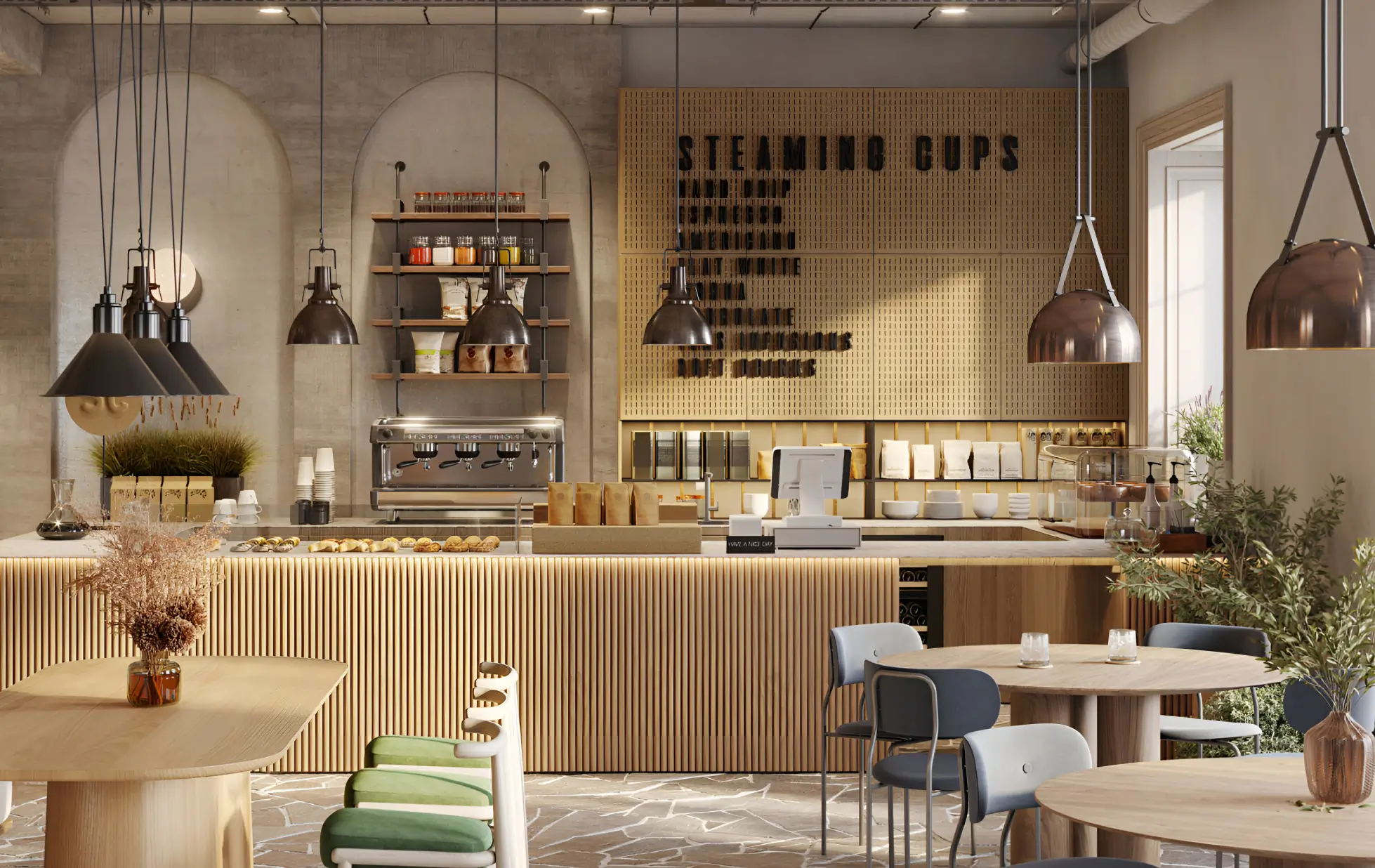
Well, the tones that have won the baton this year for the “colors of the year 2024” are the ones that give us a feel of us being human. I.e. the earthy tones around us. Other than it being a common sub-conscious choice of colors for the mass population, (it could also be a sub-conscious scream of the human brain to return to nature). Well, whatever the reason may be, the earthy tones have been chosen as the winner because of their calming and accommodating nature which adjusts with all sorts of other bright tones to neutralize them into a more soothing tone of color.
The best effect that these earthy-toned interior decor pieces will have on your clients and customers is that of making them at peace and making them stay over at the venue for a longer time than they originally planned to. When your retail stores are focused on the sale of something fascia, they tend to have detailed work on them, putting earthy and calming tones in the background helps the background to fade away with its viable effect on your customers while they surf around your products and enjoy the artistry there.
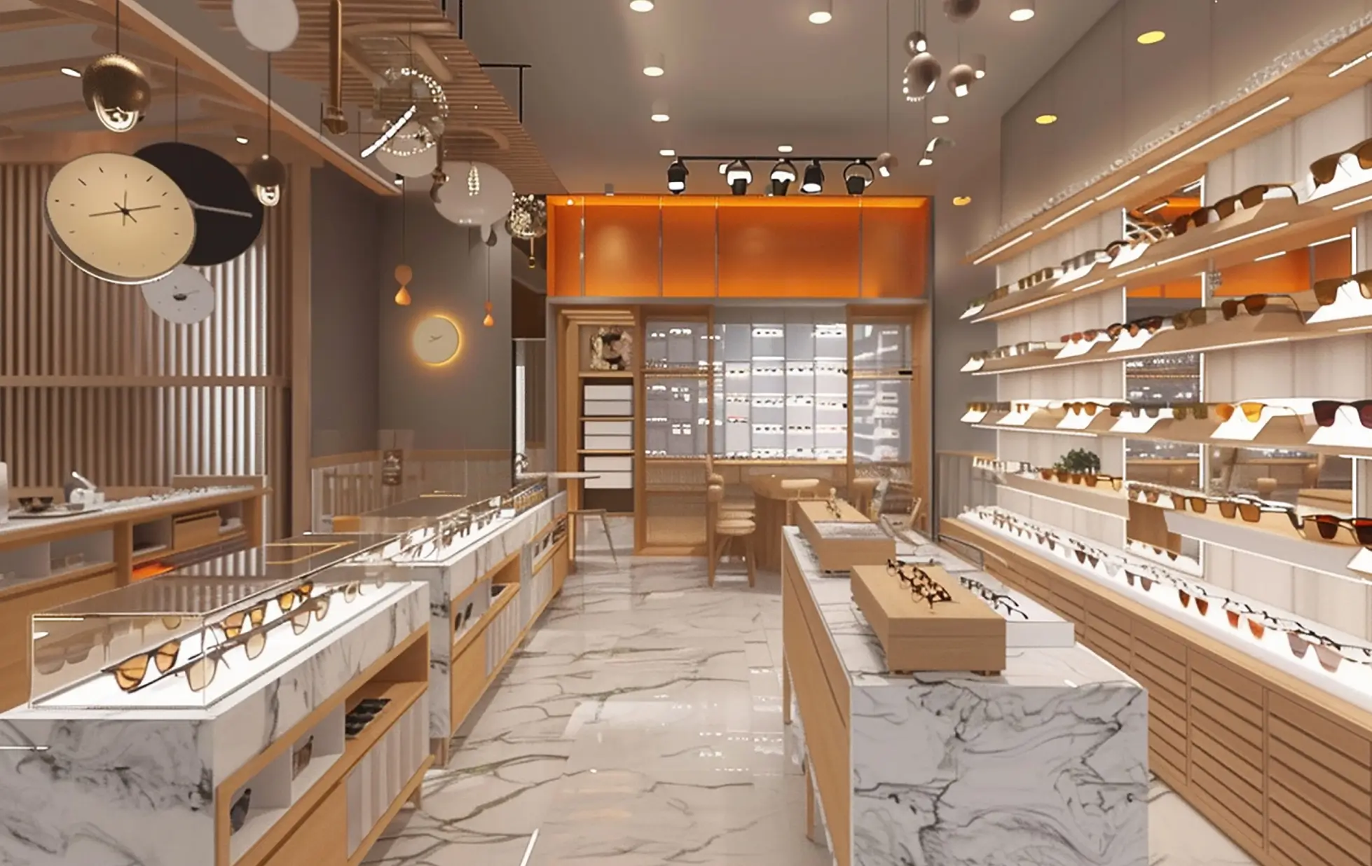
These earthy tones can be either used as they are or even mixed with brighter shades of yellow and orange to enhance the overall vibe of the store and give it a balance of modern and rustic. These shades work best as a highlighting decor, rather than an overall expression of the retail store. The majority of Retail design trends of 2024 have been known to show a contrast between ancient and modern, and using earthy interiors in your unique brand identity way is the best way to accommodate these trends into your retail store as well.
-
The Color Of The Background
Things that are often undervalued, someday or somehow always tend to come up with their newly achieved recognition of sorts. The best interior decor-based example of this shining are the background colors of grey and dark beige.
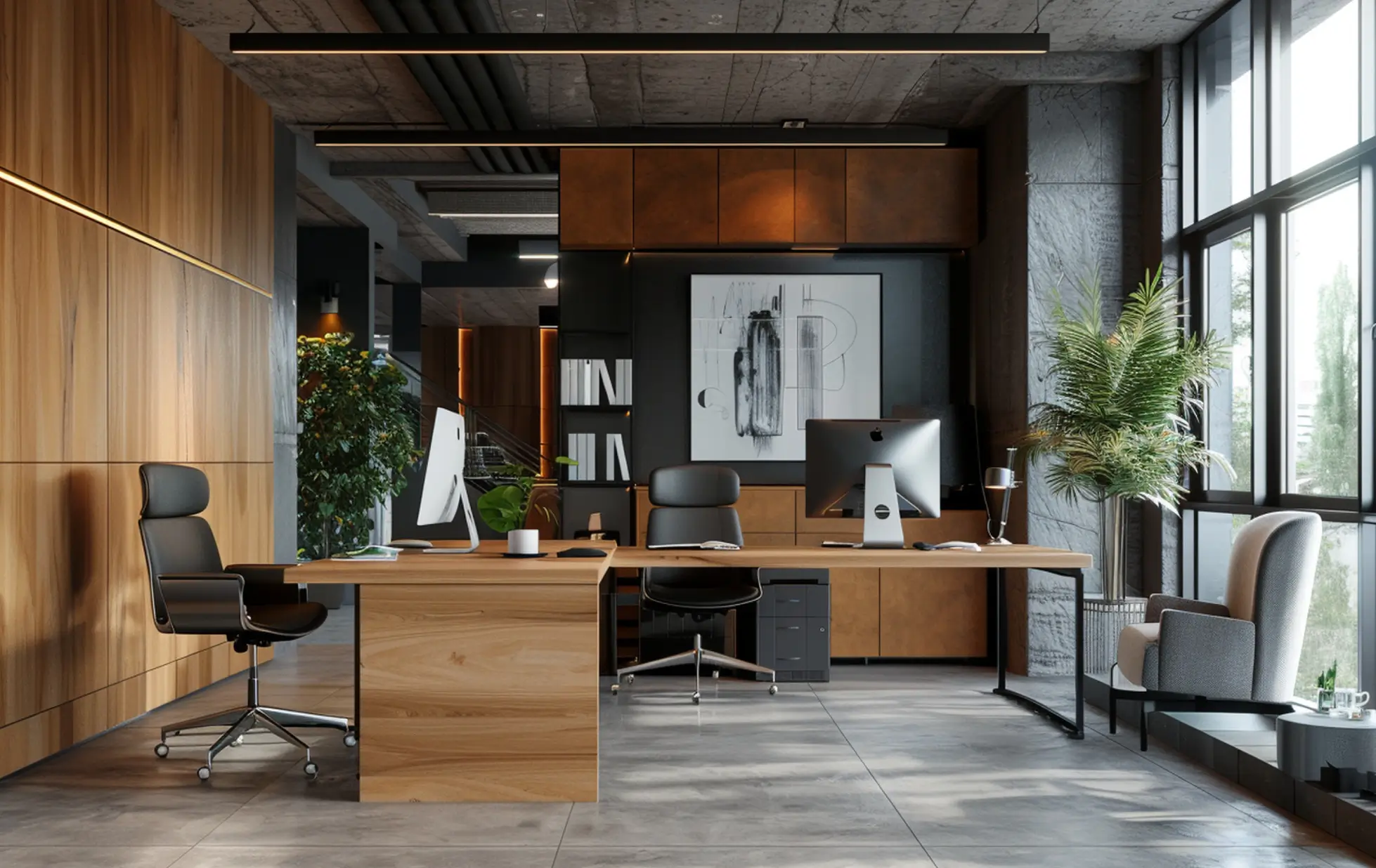
Along with browny-earthy tones, these underdogs have also seen an uprising in the year 2024. Grey and beige are considered the best colors for retail stores because they too tend to fade away in the background while leaving a considerable effect on a customer's consciousness. Using bright grey decor tables and show spaces can soothe the customer's viewpoint and enhance the product on display to its best worth.
Usually, while grey is paired well with the color white, it is also possible to pair the color with whatever dark or bright color one wants. For instance, pairing grey with dark green can enhance the brand's “pride” part, while using grey with bright yellow can enhance the brand's “creative” aspect. Hence usage of these colors can be altered according to the company's needs and requirements according to the space the color is being used for. Other than particular spaces, the best way to utilize grey can be to use the color in the overall ceiling range of it. Which rather gives a customer a brilliant twist from teh common color of white but with a sense of familiarity, since the color is not unknown but simply hidden in hindsight.
-
The Evergreen Pastels
This part of the article is called “Pastels are the new black”, this name suits the section best because when we think of black, we think of it making us look thinner and it goes well with whatever other color you wanna pair it up with. Well, get ready to feel the same way with pastels now. Though pastels may be the last-to-last “color of the year” they are still considered to be the best form of palette for any interior decor since these colors never run out of trends.
Pastels are the colors that have their ups and downs but the best thing about these colors is their nature of being discreet and light in viewing. Due to their appreciable nature, these colors also tend to get dull after a while, but this is where an interior designer's creativity cuts through. Pastels are one of those rare palettes that can be enhanced in whatever way wanted since they tend to camouflage into the background and can be covered with whatever new pattern one wants to use. This is where your brand identity can be pulled in and the colors be framed in whatever way you would want them to be framed.
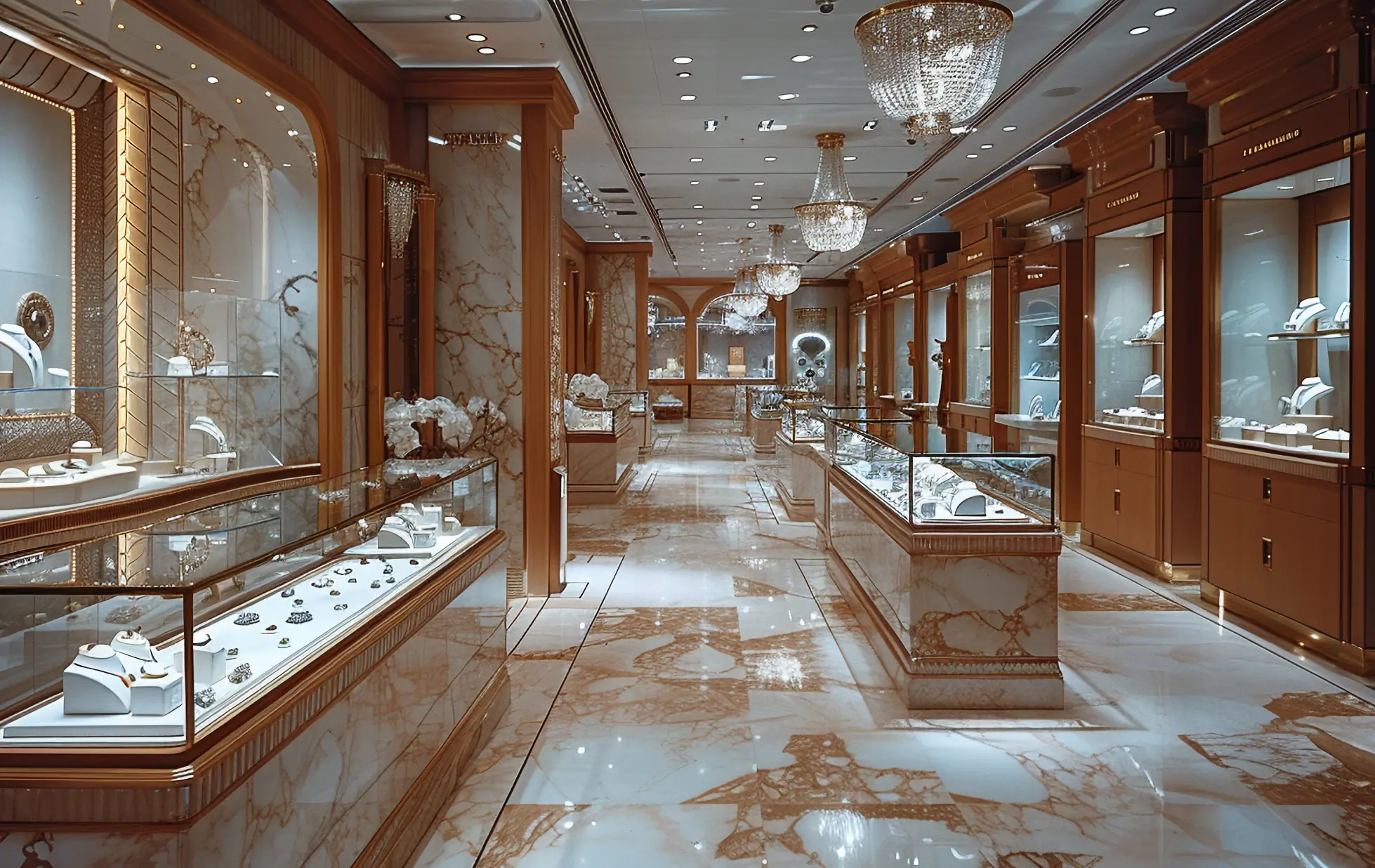
Pastel decor options can vary from waiting spaces to modern show spaces of sorts. Since they are considered cool-toned colors, they work best for products that tend to have a darker tone of color or are heavy in viewing, eg. men's watch collection. Anything with a heavy metal build can work best with the color palette and will make the product enhance better and in a good and powerful tone if paired well with bold shades of heavy metal blue or royal dark blue.
-
An Ocean Of Blue
The famous colors of 2024 list also include a specific tone of color rather than all the vague categories. These specific tones are that of blue. No wonder blue is the color of choice for the public due to its characteristic of being very available and the most prominent shade of color in and all around our nature as well. Though abstractly putting it forward, “blue” as a color means to be sad or occupied, it is also considered to be one of the most prominent shades of the corporate world.
Even the crimes done in the corporate sector are known as “blue-collar crimes''. Due to its social and literary association with the business world, blue is considered to be one of the best colors for retail stores. The best thing about this shade type is the variety of shades that it is available in, from ice blue to warm blue. There has been no temperature in the world that has not once in its life been associated with the color blue. Blue is such an overused color that due to its monotonous use, it has not been able to take the lead on retail design trends of 2024 interior decor.
Though overused, blue is an underplayed shade of color, especially in interior designs. The retail stores could use their interior designer's creativity and cultivate something beautiful and serene to suit the eye and enhance focus on teh products on display rather than the strong overpowering blue in the background. No matter what, blue shall always be the evergreen color of teh commercial world, and hence even using 4 different tones of blue in the same retail store will still keep the energy up and not make the store look filled with blue. Every tone of blue tends to have a whole new personality associated with it and these personalities can be captured in fancy decor items or simply the storage desks of the store, which make the storage space look beautiful and organized which is contrary to its actual work.
-
The Other Pops Of Nature
While we have covered many natural hues here, starting from the earth and moving extremely up into the sky, we have sincerely forgotten to put in the color of the main ecosystem, i.e. GREEN. The shades of green have been in demand since 202 according to color experts. The best way to accommodate these tones of green is to accommodate them according to your need to show “respect and sincerity” in your retail stores. These spaces can be your cashier tables or even highlighting one wall of the store in royal dark green to bring a sub-conscious focus on the retail store being captivating and true to its firm character.
The effects of green shades on the customer's brains are Low-wavelength hues that increase concentration and efficiency while fostering calmness and relaxation. Green is a great color to improve concentration because of this. In addition to being among the most visually friendly hues, it evokes a sense of the natural world. These retail design trends of 2024 are the ones that accommodate the naturalistic aspect of the world, which are a mass effective color due to their appeal to youngsters and elders alike. Who doesn't like to be close to nature in their comfort zone.
Green design can draw attention to a business's dedication to sustainability and environmental friendliness, attracting customers who care about the environment. Adding plants and other natural elements can enhance the acoustics and air quality, making the workplace more comfortable for both staff and clients. All things considered, the green interior design enhances the environment and promotes a pleasurable and enjoyable shopping experience.
Inout Interior Designers aims to provide its consumers with the best possible solutions for all their interior-related needs along with working on your turnkey projects to make the whole process more feasible and less stressful. Our interior designing firm is dedicated to enhancing your brand's personality and showing glimpses of the same in our designs on your commercial spaces.
Our past projects are proof that we don't follow a particular working theme but are accommodative of all your plans, be they contemporary or even semi-modern to any or all of its extent. We believe in thorough client counseling and provide our best assistance to make the employer understand the project of their dreams the execution of which has been centered in our hands and expertise.
Working on interior designing projects of commercial spaces is our specialty and we focus our designs on promoting your viewership and psychological impact on anyone who glances once at your unique interior patterns. It is our vision to give you our best selves so as to satisfy your dream project's execution.
 09 July 2024


