By admin — 10 June 2024
How to Incorporate Gen Z Trends into
Corporate Office Interior Design
Generations change and designs follow. People's love for subjective and modifying designs is ironically constant yet ever changing. “Genz” vibe is the new craze of the town, from aesthetics to feelings, everything can be “genz- fied” according to us. The era of Gen Z starts from the mid 1990s and mid- 2010s. This generation is also known to be the currently most balanced aware of the internet and social media. This innately self- aware generation focuses its idea to be “sustainable” in nature, be it the AI modifications or even the naturalistic decorates. It is all here to last longer.
This article shall emphasis on the various Gen Z Interior Design Trends that have been or can be incorporated in Corporate Office Interior Designs, to make your corporate space more appealing and relatable to the larger crowd of the nation. These incorporations may be tricky at first, but WE PROMISE that as we dig deeper into the text, you will be able to comprehend with pretty ease, and will be a pro in no time.
Now to pull out your interior trends out of FOMO, follow these steps:
-
Go All Techy In The Office!
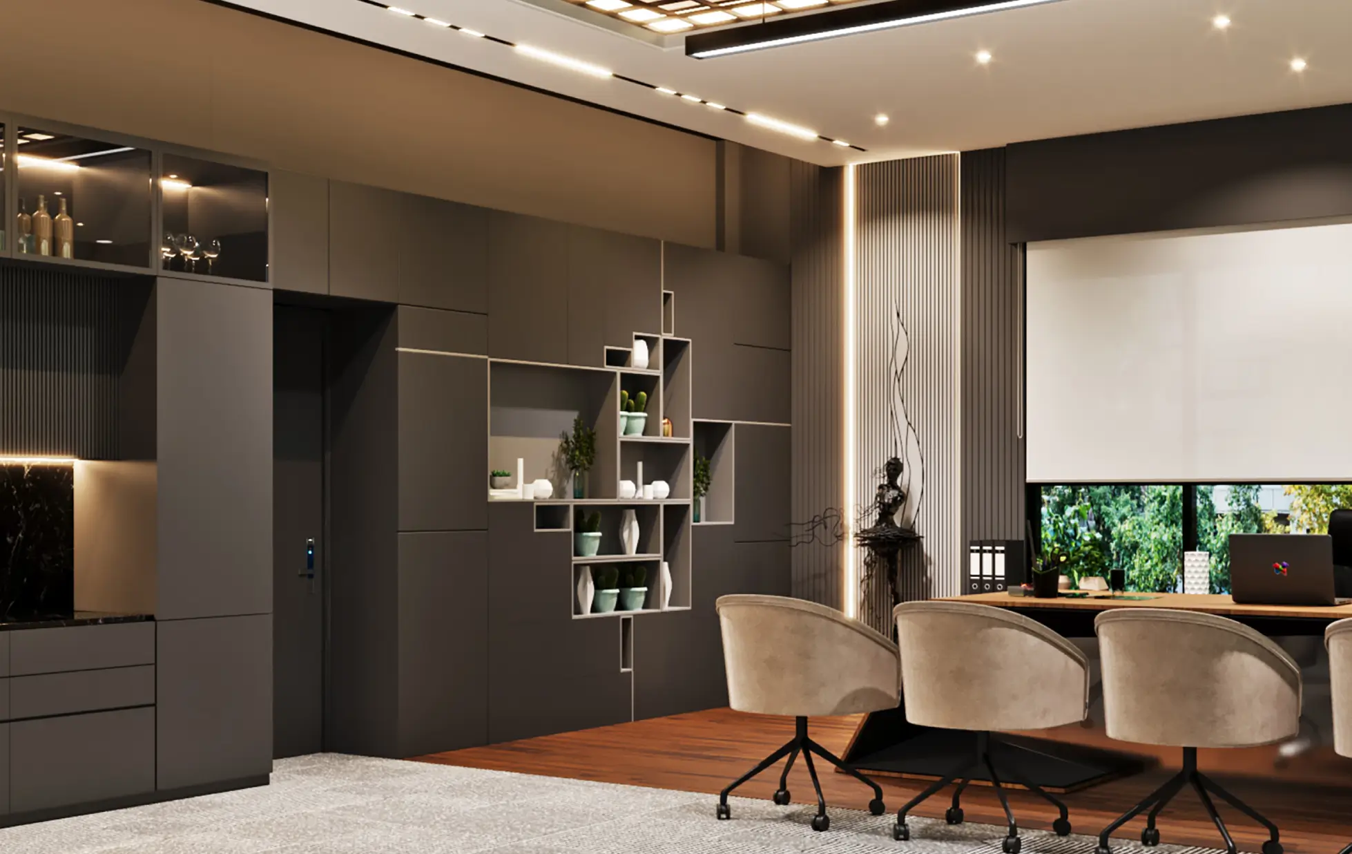
Gen Zs have been known to have a love for devices and gadgets from the beginning of their generation. What else is better than to incorporate the art of tech symmetry and gadget designs into the functional space of your corporate office interior designs. Design of symmetry, glowing borders of bulgy shapes, using color variations for ultimate glossy or matt. All of it becomes a part of gen z trends. All in all, to move forward with the tech patterns, all one has to imagine is a Weird alien flexing his own unorthodox spaceship with all the glowing and dull surfaces that one can explore.
The interiors can be explored via using the features of walls as well. Forming patterns of “inside of a sim card”, by applying colored decal sheets over dull colors. Combining the skills of wood carving and surface of wall textures to better facilitate the features of random geometric patterns. It is to be a futuristic office in all its senses.
-
Ceilings With Feelings
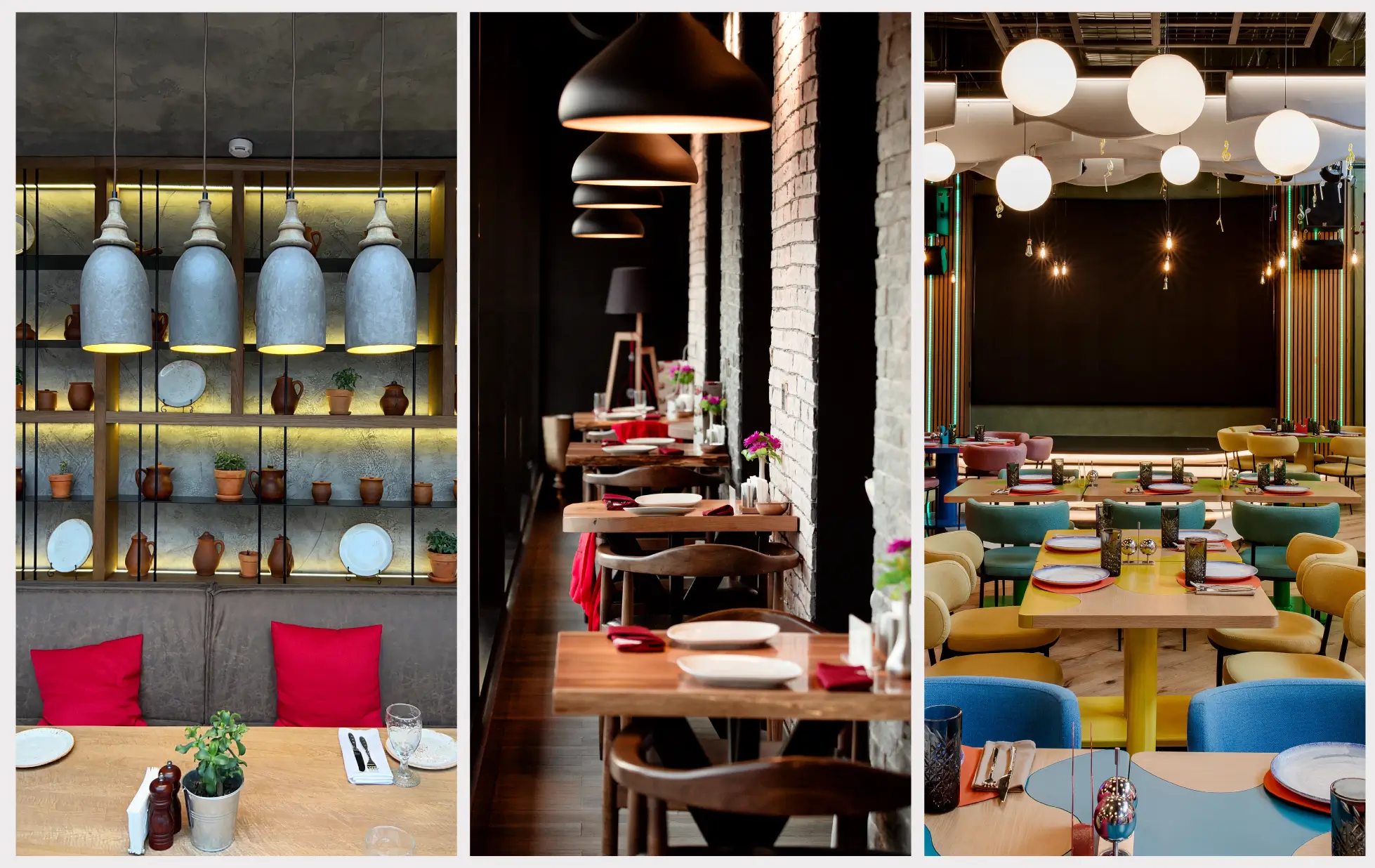
New emerging spaces of ceiling designs have entered the market where you keep the designings of the top as “no cap”. To keep the top raw and vibrant is the new corporate featuring reality. Raw as in not unfinished, but the idea of the patterns are to create a better sense of comfort in being presentable without following the conventional sense of “perfect”.
Giving the ceiling designs a studio feel, using long and big non conventional lights hanging around the place, leaving the space with pipes going through the area that are again accommodated in the ceiling perfectly using color sensibility. These designs of ceiling vulnerability and finding pattern in being unhinged has emerged as a usable state of art in restaurants, showrooms, office working spaces, and obviously shooting studios.
-
Lowkey Grounded
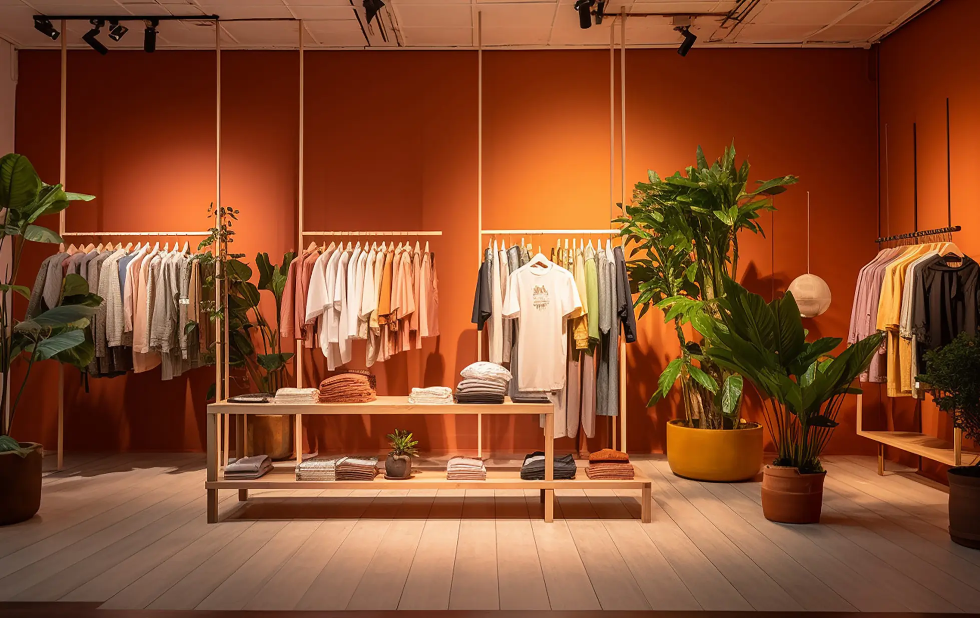
The effect of every form of design is bound to be psychological as well, hence since there has been a sense of awareness regarding the need for wellbeing of the brain as well. The corporate spaces have increased their focus on providing natural looking spaces for their employees. Be it usage of hanging plants, botanic wall patterns or even using colorful floral patterns for the other interior spaces of the office. People are getting creative with nature, and this time, not in a sense that will destroy it.
Though money plants have been an all time favorite for the indoors, new explorations show that pot plants like snake plant, peace lily, pothos or even the ZZ Plant is all about creating a minimalistically designed space with major pieces of plants to showcase.
-
Walls Are Your Canvas!
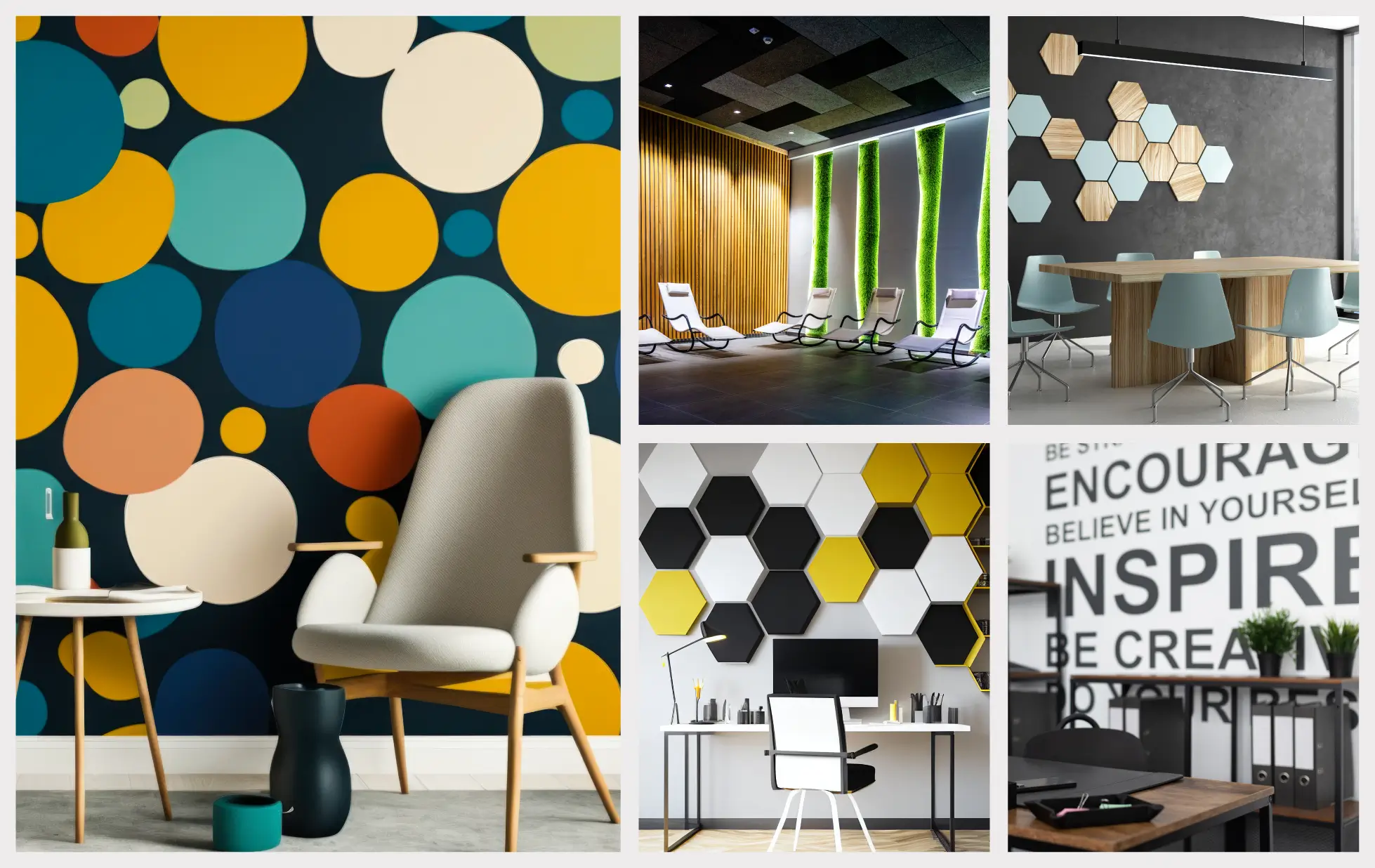
Main focus of the interiors becomes the instruments and the furniture that are to be added into the space, while leaving one of the most EFFECTIVE pieces of the space, i.e. the walls. The literal canvas that covers the majority of the vision area yet is worked upon the least. Various effects and pattern formations can be done on the wall so as to cover a larger area with pattern while leaving the furniture process to the minimalism.
Putting up colored dripping effects on white or plain walls, to fill the walls of bright color with dual shaded graffiti, quotes and writings on the wall to gain attention, and also carving lines and shapes into the walls. While all this can be easily done, it tends to leave a larger effect on the viewers with a strong undertone of the messages that you are trying to proceed with using the wall designs.
-
When The Floor Takes A Stand
One might think that since the walls, the ceiling and the overall pattern of interior have been covered, why shall one skip the usage of the FLOOR! Well we won't be ghosting the floor, we will COVER IT as well.
The Floors are like walls, mostly ignored yet covering one of the biggest vision areas of the space, in hindsight the viewers usually ignore the floor and move on to the main contents of the office, yet it's time and the age to give a character development to the floor as well. There have been upcoming trends in the showrooms predominantly to use bold and dark colors for the ground. Keeping that in mind, it is now also the time to use decorative pieces like a carpet or small jute or crochet mats for the surface all over in proper patterns. Using various shads for the floor may also work wonders if the overall picturisation of the space is light and minimalistic.
Using different items on the floor decor is equally important because the color effect of the floor is bound to affect the overall look of the place. If the automobile showroom floor is black gloss and the cars that they are showing are light colored, the products glitter in limelight while if the floor remains to be light as well, the product highlight won't affect much.
Creating Wonders With Inout Interiors
Inout Interiors round and about bring the whole package to the table. The firm being a turnkey interior design company of talented and non- conventional interior geniuses, the company holds the power to be as adaptable and mutable as possible to get one of the best results for the design template brief designs that you provide us with, mixing it with the talent or production that we bring up.
Be it gen z trends or corporate traditional designs, Inout Interiors provides the customers with every possible aesthetic one can ask for. With intelligent shade mix and the ability to create prospective spaces for clean design it is our work to produce the best and unique business interiors. Whatever the business may be, our company is ready with a variety of employees who understand and provide for the client and their needs without letting you worry about the use of different agencies for different deeds.
As a turnkey company, we are able to better understand the entire layout of the site in all its potentiality without the confusion of changing layouts. From start to end, it is our job to suggest you current designs for better clientele and also build something unique on the already existing trends to make your company stand out from the crowd.
 06 June 2024


